How it all works together
The following example is the simplest of UIs and will teach you the basics.
Step 1
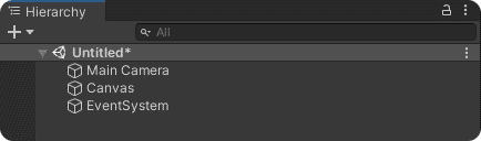
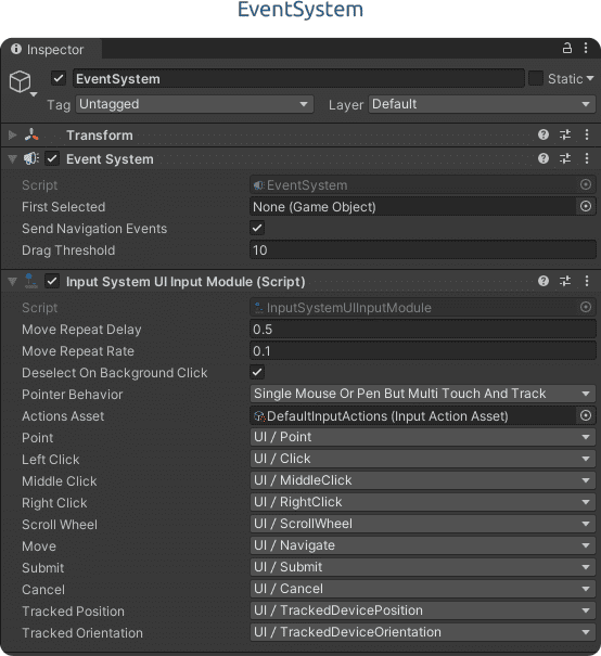
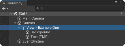
Create a new Scene and add a Canvas to it. You should have a Main Camera, a Canvas and a EventSystem.
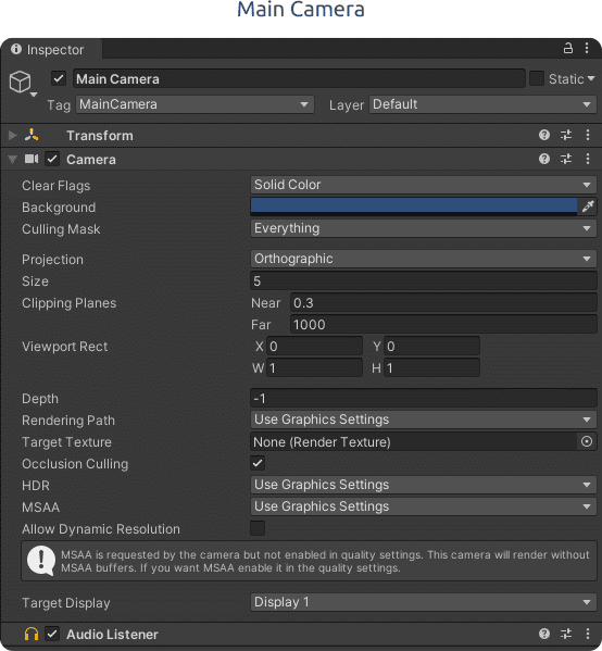
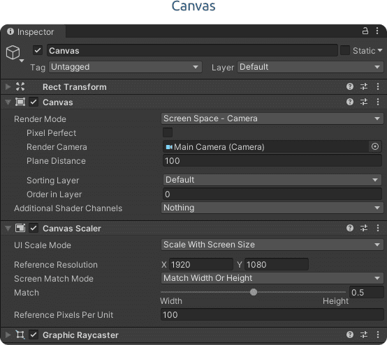
Notice that on the Canvas component, for this example, we changed the Render Mode to Screen Space – Camera and set the Render Camera as the Main Camera.
Also, on the Canvas Scaler component, the UI Scale Mode was set to Scale With Screen Size, the Reference Resolution was set to 1920×1080 and Match was set to 0.5 (50%).
These settings can be set to different values, but for this example please set them to the recommended ones.
Step 2
Create a new Scene and add a Canvas to it. You should have a Main Camera, a Canvas and a EventSystem.

Step 3
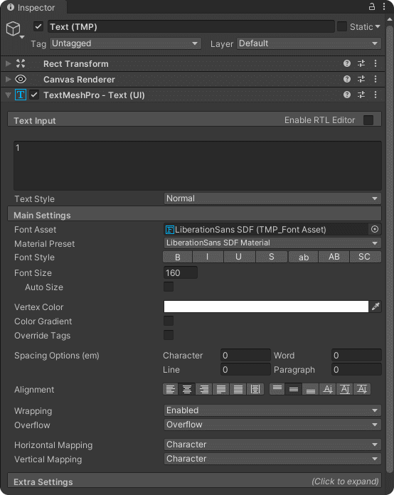
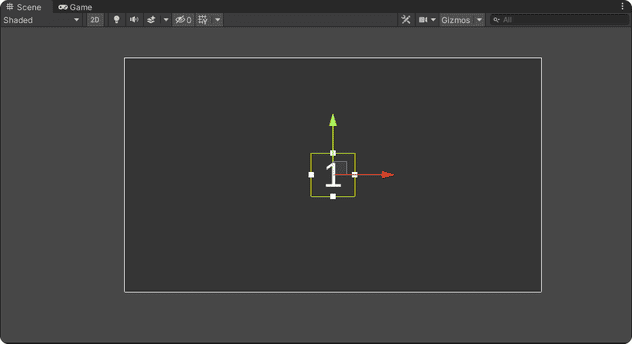
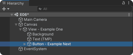
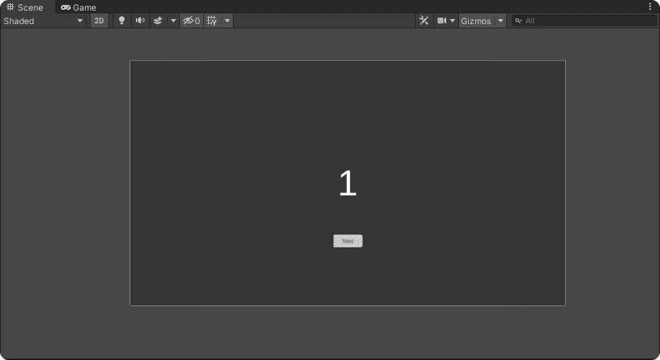
To be able to visually identify the view, we’ll add a TextMeshPro component and set its text value to ‘1′.
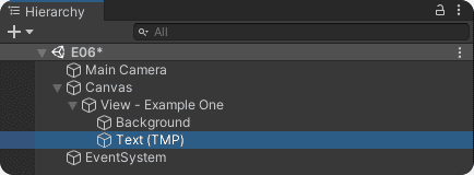
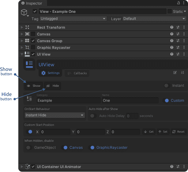
Then we’ll set a custom category and name for the view (“Example“/”One”) to be able to identify it throughout the system. We use custom a category and name to avoid using the database system (and to make this example easier to understand)
Also, we need to hide this view on Start, so we set the OnStart Behaviour to Instant Hide.
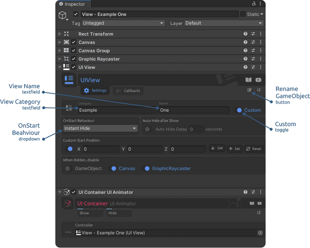
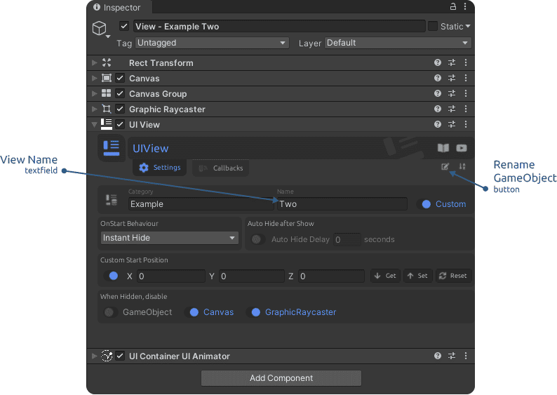
After setting the Category and Name, click the Rename button to help up identify this view in the Hierarchy view.
Notice that the UIView already has a UIContainer UI Animator attached and connected (as the Controller). This works because the UIView is also a UIContainer (with extra settings). Thus a move animation is already set up and enabled for both show and hide. So we don’t need to add an animation for this container, as one has already been set up.
Step 4
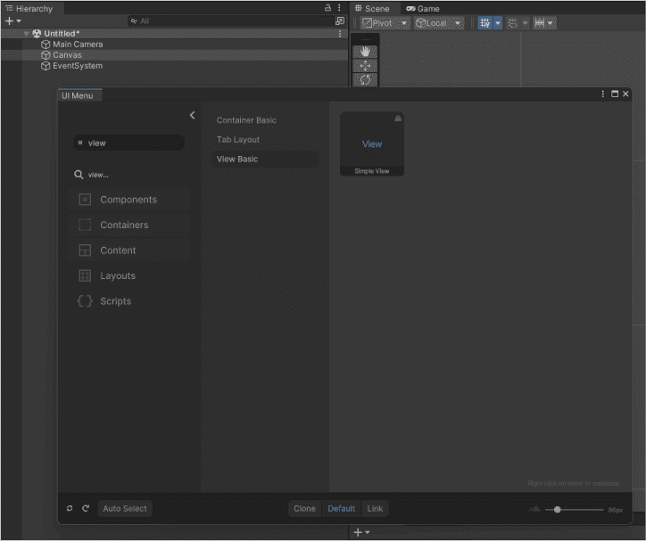
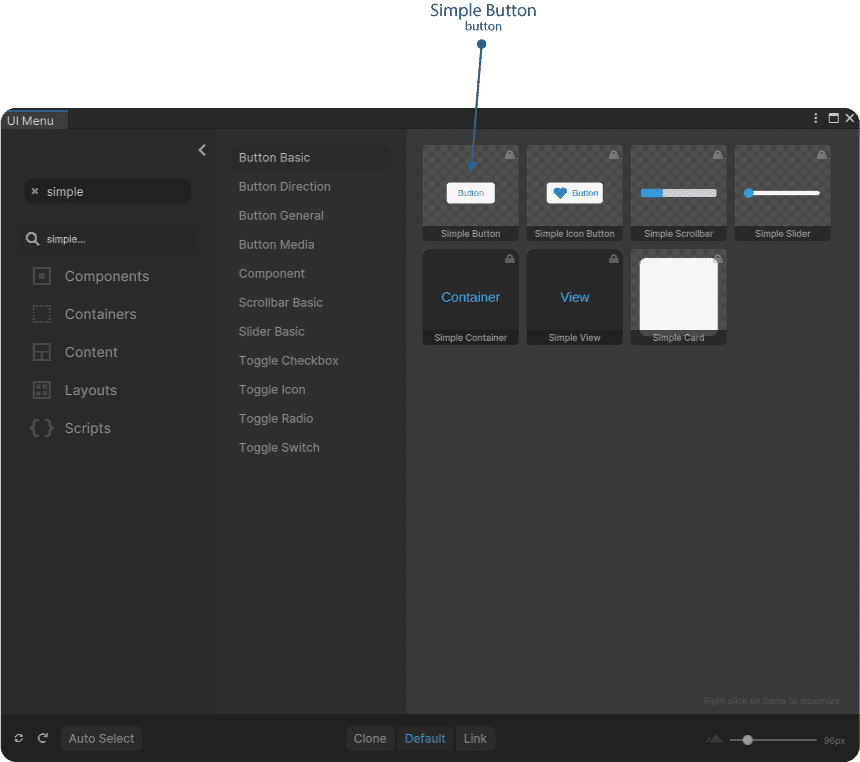
Add a button. Select the UIView, open the UIMenu, search for ‘simple’ and add a ‘Simple Button’ (large).
Now we need to set up the button:
- Hierarchy view – select the button
- Scene view – move the button down
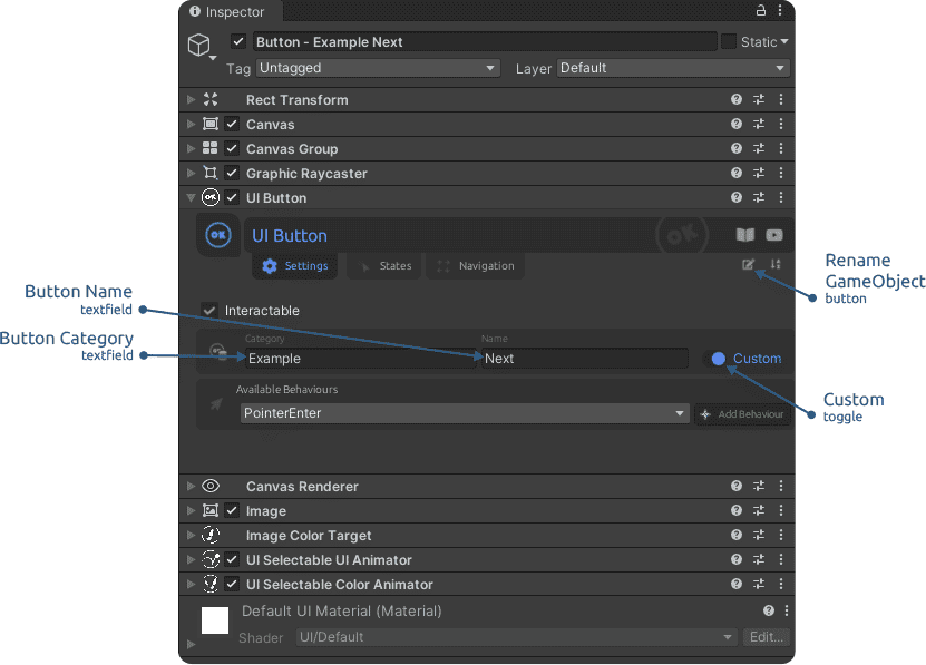
- Inspector view – set the button category and name (“Example“/”Next”), then click the Rename button. Again, we’re using custom category and name to avoid using the database.
Next select the button’s Label (its child) and set the TextMeshPro text value to “Next”.

Enter Play Mode, select the UIView and click on the Show and Hide buttons to check out the show/hide animations. Also, the button is animated and can be tested. The Show and Hide buttons are visible/available only in Play Mode. They trigger all the actions and animations set for the respective state.
Step 5
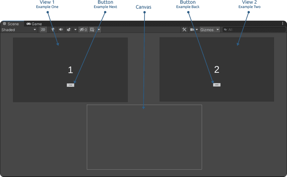
Duplicate the UIView and set its name to “Two” (remember to click the Rename button). Then change the middle text label to “2”. A select the second view’s button name to “Back” (remember to click the Rename button and also to change the button child Label text value to “Back” as well).
To be able to see both views at once you can move them in the Scene, as they will snap to the Custom Start Position. This setting is enabled by default and will move the view to the set position in Awake.
Step 6
Up to this point we created two views, each having its own button. But there is nothing connecting them in a functional way. So now is the time to create a simple UI flow that describes how these views and button work together.
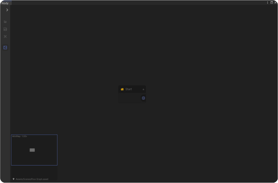
Create a Flow Graph and name it “ExampleFlowGraph”. We will use the Project view context menu to create a new Flow Graph asset. Right click the ‘Assets’ folder and select ‘Create > Doozy > Flow Graph’. Next double click the newly created graph and it will be loaded in the Nody window, that will also open together with the Nody Inspector window.
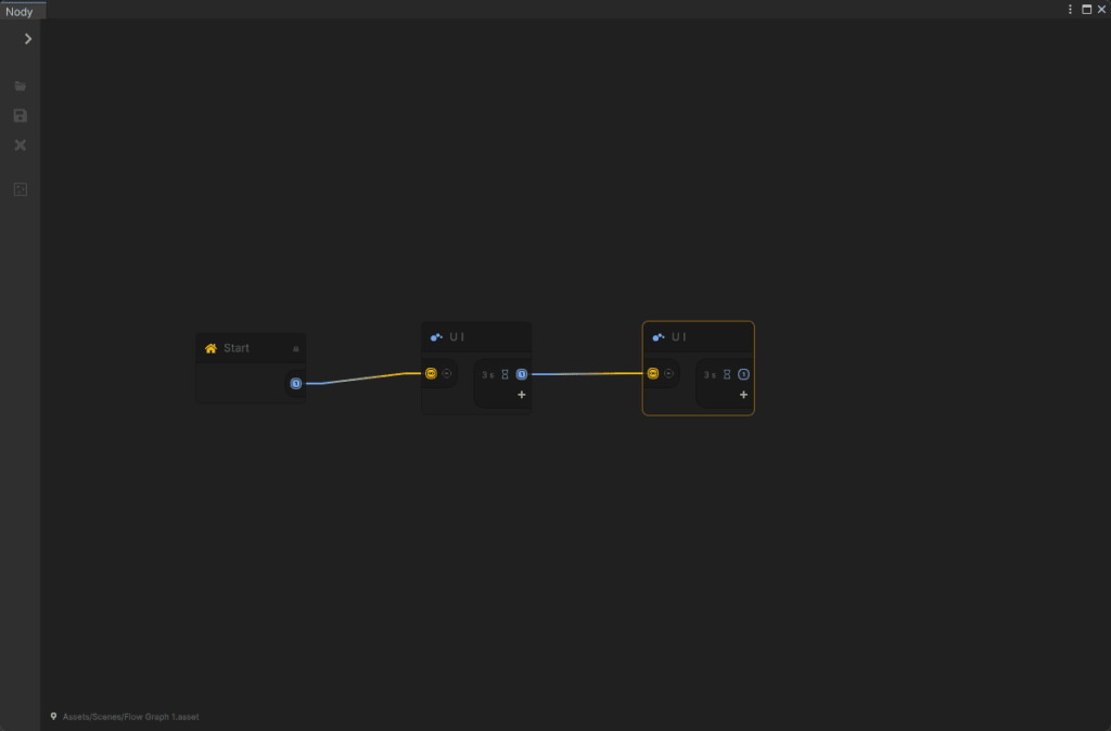
Next create two UI nodes and connect them (right click the graph and select Create Node OR press the Spacebar twice, then look for the UI node and click on it).
Step 7
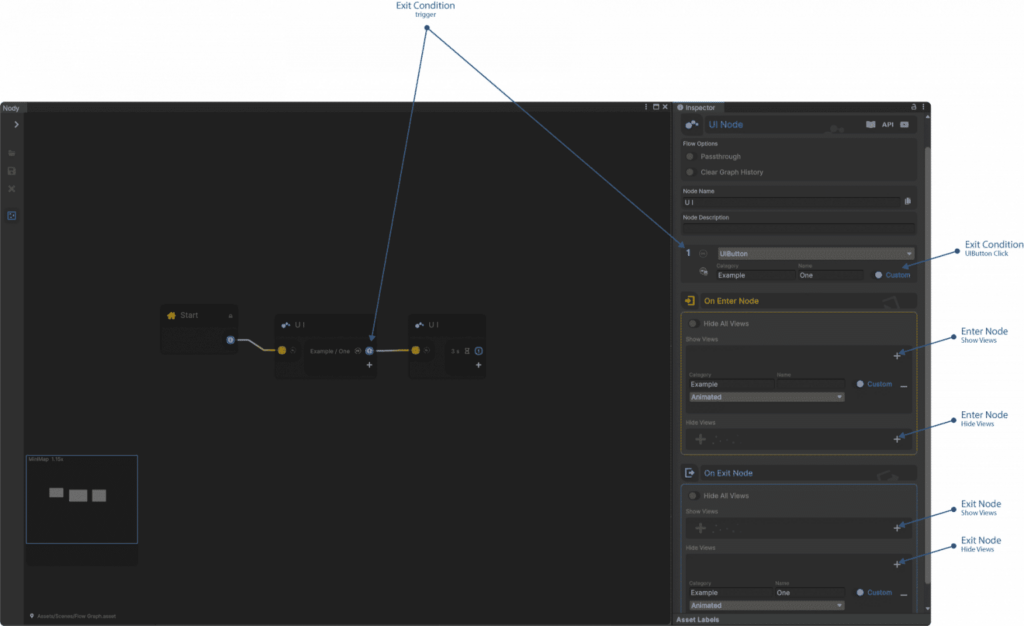
Set up the nodes. On the first UI node, set up the exit condition and what to show on Enter Node and hide on Exit Node.
Enable the Clear Graph History because we’ll be using the ‘Back’ button functionality and want to clear the history every time the graph activates the first node.
Set the Exit Condition to UIButton and set the button category and name to the values of the button in the first view (“Example”/”Next”).
On Enter Node we want to show the first view, so we set the view category and name to “Example”/”One”.
On Exit Node we want to hide the first view, so we set the same view category and name.
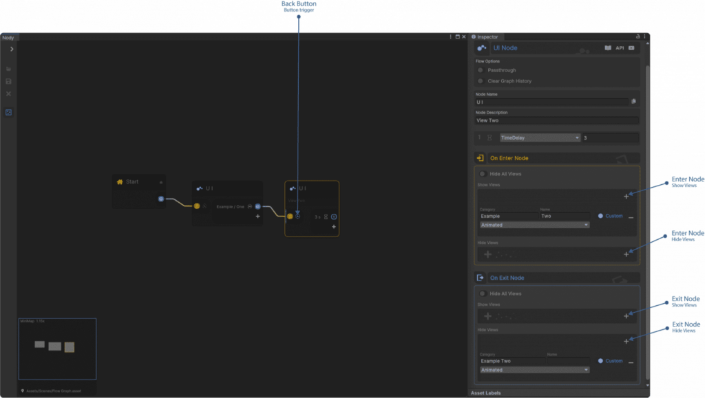
For the second node we do not use the normal exit condition, as we’re interested of going back. Thus we click the ‘Back’ button trigger to enable it. Any button that has the button name “Back” will trigger it (and also the ‘Cancel’ action of the new Input System – in this case the [Escape] key.
As for the Enter and Exit node settings, they should be similar to the ones in the previous node, but for the second view “Example”/”Two”.
Step 8
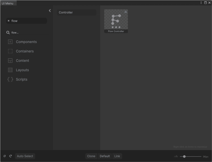
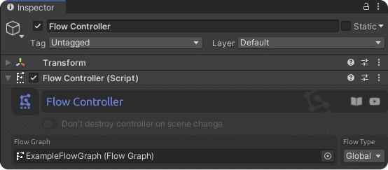
Now we only need one more ingredient to make everything work and that is a Flow Controller. We need it to activate and control our UI flow (the Flow Graph), since the graph is nothing more than data.
Select the Canvas, open the UIMenu, search for “flow” and add it to the Scene.
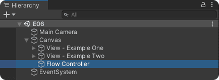
After the Flow Controller was added, select it and set the Flow Graph reference.
Step 9
Done. Now enter Play Mode and test your UI. You can open Nody and select the Flow Controller to see the graph working while you go from one view to the other.
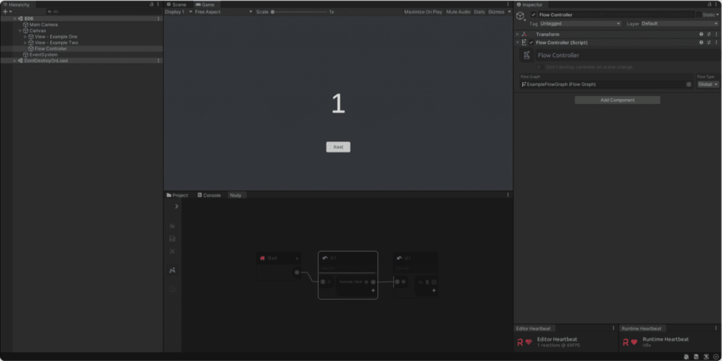
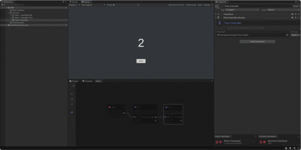
Also try going back from View Two by pressing the [Escape] key (the ‘Back’ button)
Now you have one of the simplest of UIs working and you can start playing with its settings. Test out animation options, add more views, add more nodes and see what else you can do.
This was just a basic tutorial and know that you can create and manage very complex UI structures with DoozyUI.
Have fun! 
